Methodology
Design thinking
Alerts and planogram management presented quite an interesting challenge, since there were two types of users to deal with, those who manage the stores and those who create and send the planograms, they were different objectives but they went hand in hand and to digitize in the most optimal way it was necessary to understand the whole process from the beginning.
Design thinking
3 Months
Desktop and mobile
Since there were two realities, it was found that one of the main problems was the communication between the area that designs and sends the planogram and the store, who are the ones who implement it. In order to raise awareness on both sides, it was decided to hold a workshop where previously designed wireframes could be tested, and to verify which were the biggest pain points of the users.
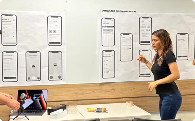
Detect which are the main pains when publishing and implementing planograms.
Validate if the solution previously generated in wireframes solves the users' main pains.
Get insights from users to see what other improvements can be added for a first MVP and for future versions.
It is a canvas that allowed us to visualize the users' journey to achieve a goal. With the help of the map of that journey we got an idea of the users' motivations, needs and pain points.
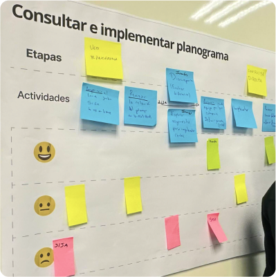
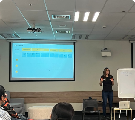
Validate 3 flows that are in a wireframes version, to confirm if this possible solution, effectively solves their problems that are presented in the different tasks that the users had to perform.
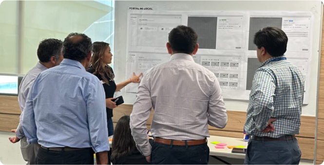
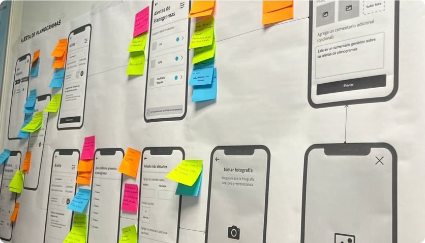
In general, many valuable insights were obtained from the different types of users, we spent about 3 days to collect everything, analyze in detail and find the patterns that would be the main indicators to start prioritizing the first MVP in terms of design.
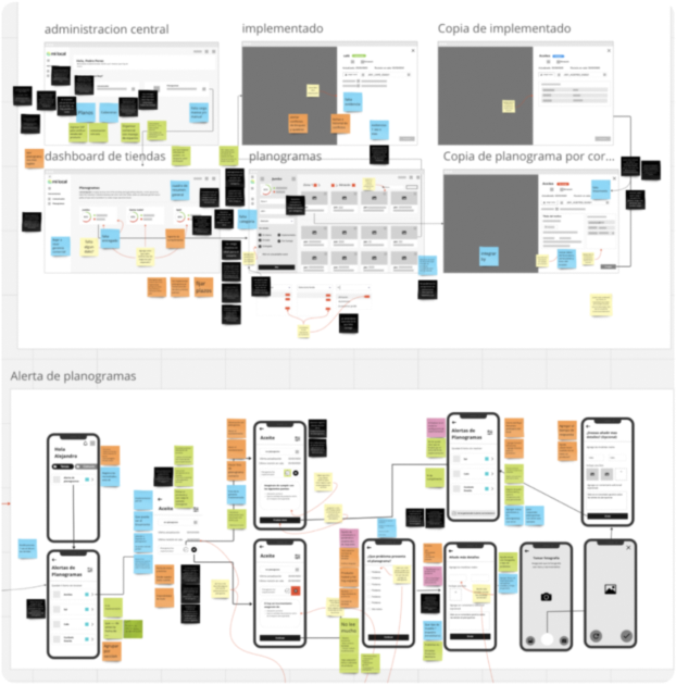
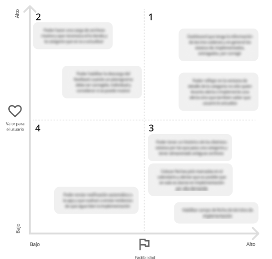
Once it was clear what were the main pains and opportunities for improvement for the users, it was necessary to have a session with the entire development team and product owner to ensure that the functionalities of the first MVP are really feasible within the time limit, and that they bring value to the business.
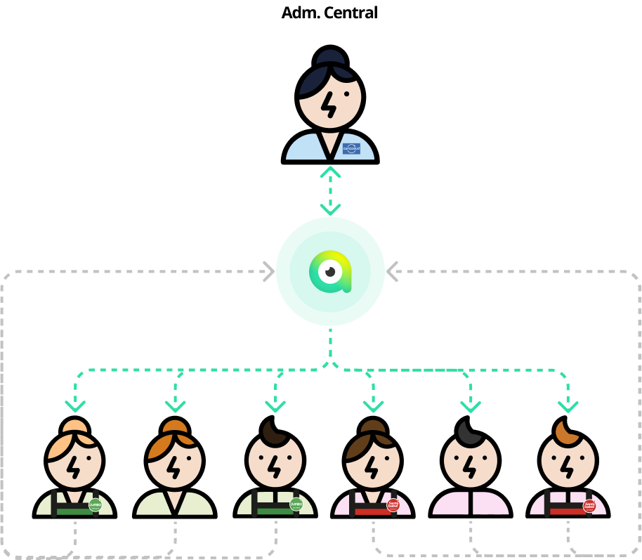
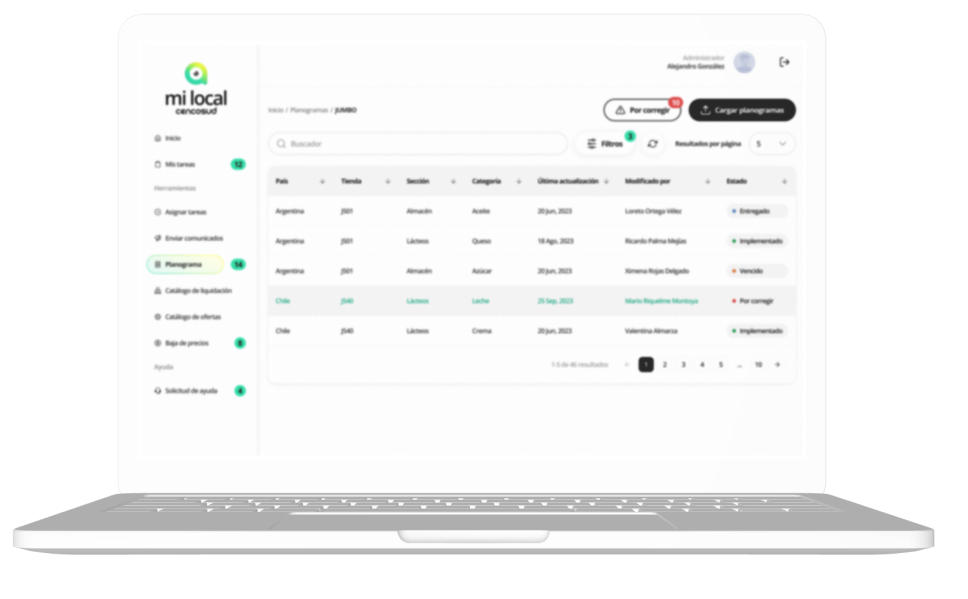
The entire process of sending planograms, implementation and notification that the task was completed by the stores was digitized, it was a very dense and challenging flow that had to be considered as well as the devices on which each user had to access, which had to be fast and intuitive.
I can drive your project or be part of your team.